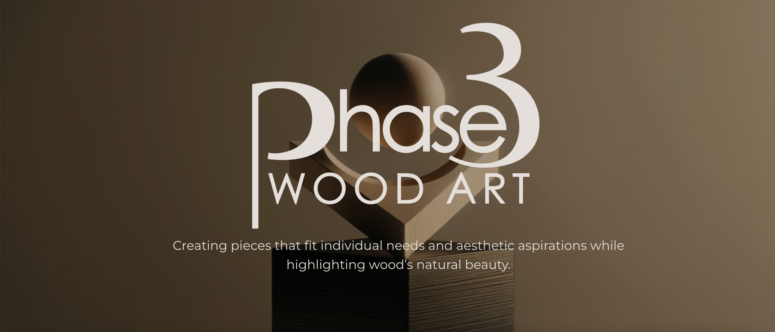
Phase3 Wood Art is a small business focused on creating one of a kind, made-to-order woodwork pieces.
Project Overview
Problem
Made-to-order businesses often lack clear, approachable purchasing experiences, leaving customers hesitant and unsure of what to expect.
Solution
Designing a site that clearly explains the purchasing process and showcases past work to build confidence.
Scope
Web Design
Timeline
February 2026 - March 2026
Tools
Figma, Affinity, Squarespace
RESEARCH & DISCOVERY
Client Kickoff
A formal meeting with the client revealed three core needs:
showcase past work, streamline customer contact, and demystify the purchasing process. It also established a key constraint, the site needed to be manageable by the client independently: making Squarespace the right platform choice.
Competing custom woodwork sites shared a common flaw. Most had vague or missing process explanations that left buyers guessing how to actually place an order. This identified a clear opportunity to differentiate Phase3 through transparency and structure, not just aesthetics.
Competitive Research
Custom made-to-order is a trust purchase. Every design decision on this site was made to reduce uncertainty and make reaching out feel low-risk.
Design Insight
*Note: Phase3 is in its early stages and had not yet acquired customers at the time of this project. This persona was developed based on the client's vision for his target audience and the nature of the product itself.
User Persona
Maya, 34
Home decorator and conscious consumer
Maya invests intentionally in her living space. She gravitates toward handmade, one-of-a-kind pieces over mass-produced furniture and is willing to pay more for something with craftsmanship and a story behind it. She discovers small makers through Instagram and word of mouth, but is cautious about spending money on something she cannot fully see or predict.
Pain Points
Does not know what to expect from a custom order process or how long it takes
Worries about miscommunication leading to a piece that does not match her vision
Feels hesitant to reach out without knowing the price range upfront
Core goal
To feel confident enough in the maker and the process to take the first step and get in touch.
How might we design a website that builds enough trust and transparency that a first-time visitor feels comfortable initiating a custom order, despite never having seen the finished product?
Problem Statement
Needs, Solutions, Reasonings
Need
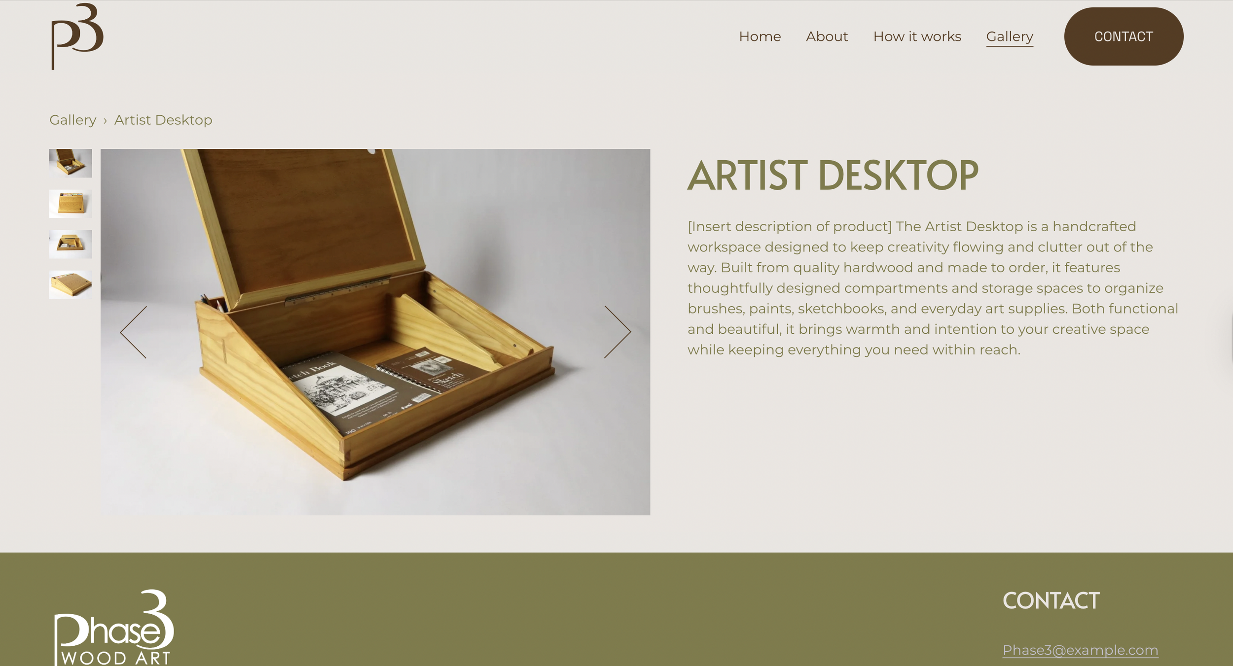
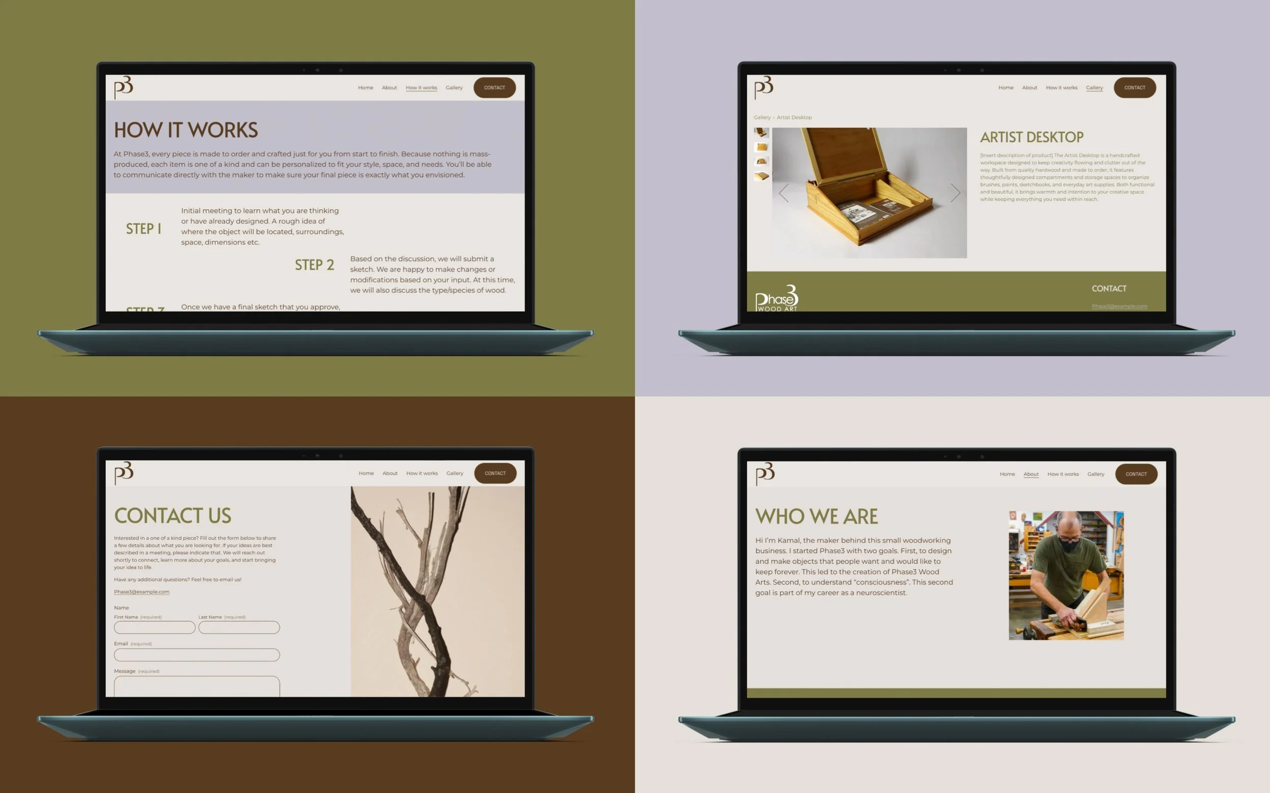
A way to showcase past projects
Solution
Gallery with hover interactivity for quick previews
Buyers need to see range and quality before they feel confident reaching out. Hover previews let users browse without losing their place, give enough detail to decide whether to click in further, and signal that the brand is modern and polished.
Why
Need
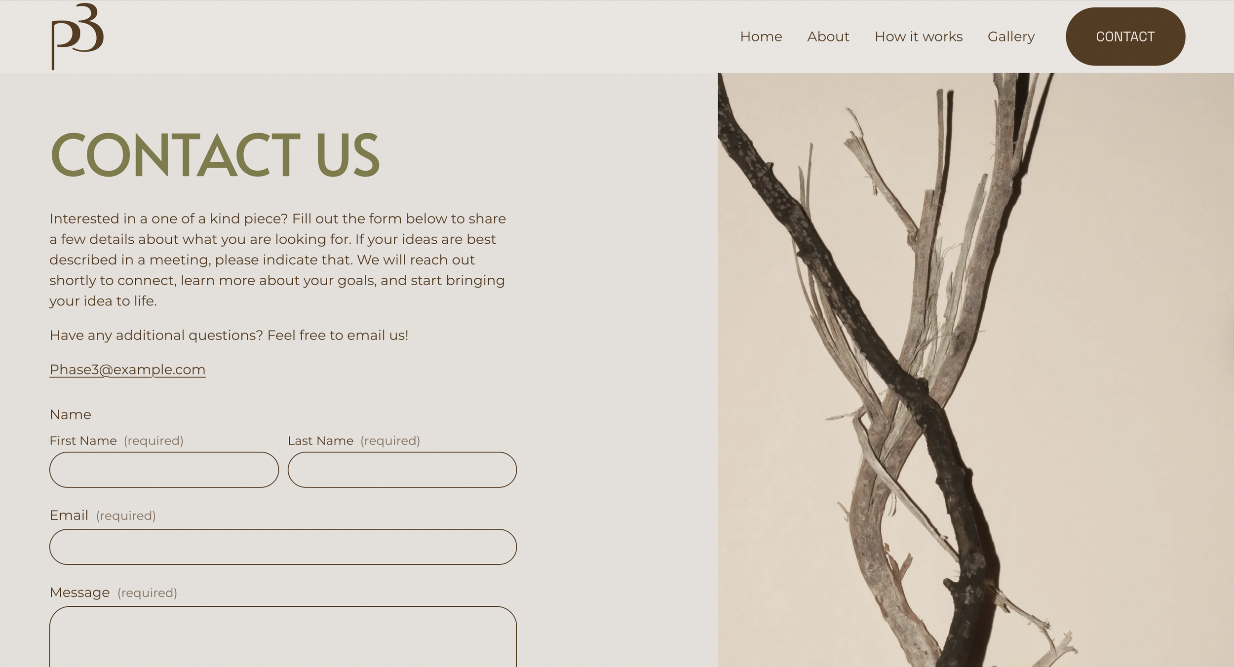
Streamlined contact with potential customers
Solution
Contact form linked to client's email with action buttons throughout the site
A raw email address puts the burden on the customer to know what to say. A structured form lowers that barrier by giving users a clear starting point, while ensuring the client receives organized information so first conversations are more productive.
Why
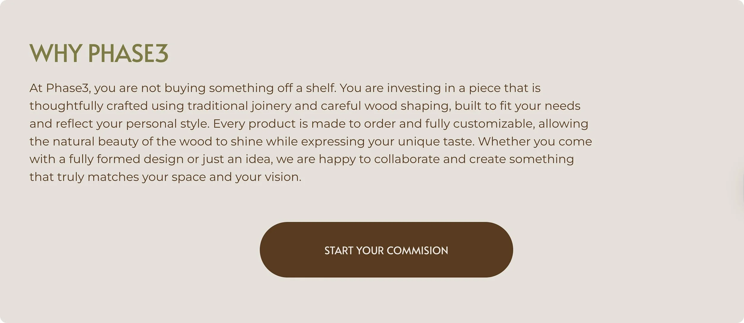
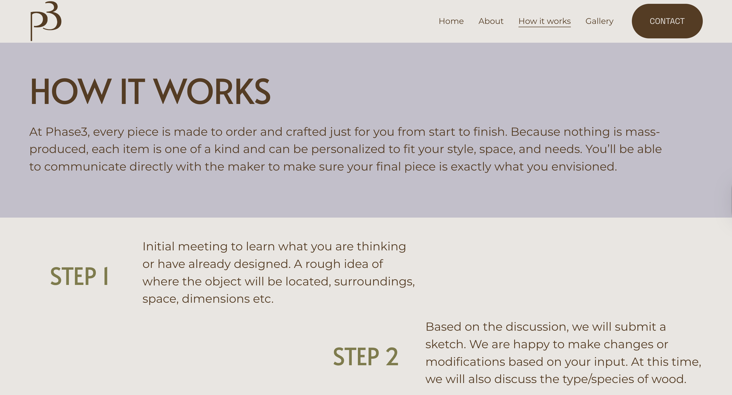
Need
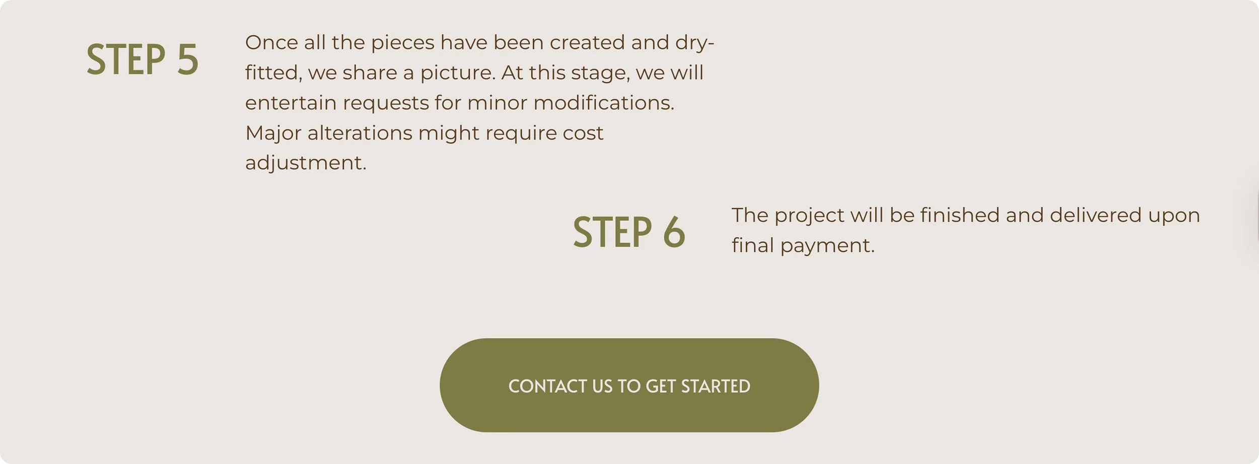
Clear explanation of the purchasing process from start to finish
Solution
Step-by-step walkthrough page from idea to final product
Breaking the process into numbered steps mirrors how the client naturally explains it, makes the commitment feel manageable, and gives the experience a structure closer to a standard e-commerce flow. The goal was to make a custom commission feel as approachable as buying something off a shelf.
Why
The Phase3 website launched successfully and is currently live. As a brand new business with no prior web presence, the site establishes a professional foundation for the client to begin attracting and converting customers.
Outcomes
A fully built and deployed Squarespace site the client can manage independently
A gallery, contact form, and process walkthrough that address the three core business needs identified at kickoff
A cohesive brand identity applied consistently across all pages
What was delivered
Throughout the design process the client provided feedback that shaped the final product, ensuring the site reflected both his vision and sound UX principles. Iterations were made based on his input at key stages of the design.
Client Feedback
*A note on metrics: Because Phase3 is in its early stages, quantitative data on conversions or traffic is not yet available. As the business grows, success will be measured by contact form submissions and commission inquiries generated through the site.
Reflection
The biggest challenge on this project was balancing the client's aesthetic preferences with UX best practices. As a maker with a strong personal vision, the client had clear ideas about how he wanted the site to look and feel. Learning to honor that vision while still advocating for design decisions that would serve the end user was a skill I developed and refined throughout the process.
The most valuable takeaway was learning how to communicate design decisions to someone outside the field. Rather than presenting solutions as finished outcomes, I learned to frame choices in terms of user goals and business impact, which made the client a more informed collaborator and made the feedback process more productive.
If I were to do this project again I would prioritize establishing lightweight user research early on, even something as simple as a short interview with a potential customer. Having real user data to reference would have made it easier to defend design decisions and ground the work in something beyond assumption.